Friday 03rd November 2023. media language and representation.
l/o: To develop the language of media analysis.
1. An album cover
2. The genre is punk rock music
3. The targeted audience is fans
4. She was represented as confident and brave. she is represented as loud and outgoing, she was also represented as a star and being strong, shouting.
5. What told me these things was the picture that was shown. what told me this was the fact she is shouting in the picture she also has stars around her head with a big star behind she also has roeses and doves.
Media language is how the media through their forms, codes, conventions and techniques communicate meanings.
connotation is things that match with others e.g. red= blood, love, pain/danger.
The ROYALTY album cover has a man holding what seems to be his child, he has tattoos all over his upper body, he has an expensive looking watch and his baby looks like it is sleeping and he has eyes closed. The album cover is black and white which makes the album cover seem sweet and caring it also gives it some old timey vibes. The born this way album is more of a loud looking album with a women that is apart of a bike and has drastic makeup. The colour of this album is more of a black then a white colour which makes it seem that this album has louder rock music in it, there is also red on her lipstick like the colour blood. The evidence there is that these are both aimed at two different audiences is the fact that the ROYALTY album looks more of a soft kind quite album and the born this way album looks more of a loud album i this this is because in the first album the man is holding a child which most people think about kindness and softness hen they see a parent with there child and in the second one she is half bike and bikes are known for being loud and noisy.
Friday 10th November 2023.
Analysis.
l/o: practise using the terminology and theory needed analyse music video.
music video conventions are
- link to lyrics
- performance/narrative
- music
- editing matchs the beat
- lighting usually bright
- music videos usually shot in urban area/studio
- camera angles are moving more often
- costume hair and make-up
- movement
the song i have picked is without me by eminem so far from the video you can see that he is in a superhero costume and the room makes it look like he has money, the camera work is very fast the scenes changes quickly and the angles are all over the place. the scenery looks warmer and nicer then the grey blank room, this also looks like he's rich and has money, with what looks like Champagne on the side next to the bed with swords and shields on the wall. the bed is also bigger then a regular bed would be, his room looks medieval, he also has two girls in his bed showing that he's not lonely and has company. his room also looks warm and comfy, the angle is also right infront with him looking at the camera.

this is another screenshot from the Eminem video showing him in more normal clothing instead of being in the superhero costume this makes him look more like a rapper and also makes him look more of a normal person instead of looking strange in the costume. in this sort of clothing he looks more gangsta and more threatening as in his superhero makes him look nicer and less threatening. in this picture he is just in a grey room which looks alone and makes him look lonely. in this picture he is wearing what looks like a quite expensive watch so maybe he's rich but even though he has money he still feels alone in his head. there is nothing around him but the colours black and grey, the clothing he is wearing as well aren't very colourful they are grey with some red and white, as in the other picture the clothing and room was filled with colours an warmth but this picture looks cold and sad. it is also a diffrent angle compared to the other one in this one he is looking straight up at the camera.
Thursday 16th November 2023.
gender: males have been represented as cheaters, women and men are being seen as sexual objects, has been represented exclusively.
sexuality: all genders were represented.
ethnicity: diverse
the artists: sam smith was represented as the star they are always central and in front, he is also the ring leader, they always have a spotlight on them.
this reflects American society as very violent, he is trying to reflect the gun violence that is increasing in America.
the video i have chosen to analyse is blank space by Taylor swift:
Representation: the representation is showing how women are flirtatious and have multiple romantic connections.
Intertextual references and their meaning: in the music video they have references of twilight, mean girls and so much more.
Genre conventions followed or subverted:
Context about the message of the song or video: the message behind the song is that females are seen as sexual objects and not real people
Friday 17th November 2023.
music videos.
l/o: To research set text
video A:
name of artist: lil Nas x
genre of song: rap
name of song: sun goes down
release date: may 21 2021
link to lyrics and meaning of video: the meaning of the song was for lil Nas x to open up about his teenage years and what it was like for him in high school, he opens up about being in the closet and wanting to end it all, and how he is thankful he had come out and his fans support him just like in the lyrics "i don't want to lie, i don't want a life" he also says things like "send me a gun and ill see the sun" this links to the video because he is sad and down through most of the video. Other links to the video are "has friends but there picking on me" and "these gay thoughts will always haunt me" in this part of the video he is at prom and it shows all of his friends with a date but he is on his own.
description to what happens in video: lil nas x was at work went home then was at prom lonely he cried in the bathroom then went back to the prom and acted like nothing had happen. it shows how he is going through something.
how the video links to the song: the video links to the song because in the video it looks like he is going through something at the start and how he is left out because all his friends have girlfriends and hes the only single one of the group and he says in the song how his friends bullied him and made homophobic jokes about him, towards the end of the song hes saying how he is grateful for his fans and were they had gotten him to and in the video it shows him dancing about in a group at prom and he is smiling and laughing.
how the artist has been represented: In the song and the video the singer has been represented like he was quite a sad person when he was younger, he is represented as a lonely person but towards the end he is represented as a happy person, he is represented as a target for getting bullied and called names.
song b:
Name of artist: radiohead
genre of song: alternative/indie
Name of song: burn the witch
release date: July 2018
link to lyrics and meaning of video: A criticism of authority and a warning against groupthink, expressing dread and skepticism. the song is talking about people hiding and avoiding eye contact this links to the video as the mayor of the town is showing someone around.
description of what happens in the video: in the video at the start there is people around a town that look like they are setting up for something then the mayor comes in with a man who is holding a clipboard they walk around the small town were this man is know testing something is off and he then gets told to climb into a wooden statue and they burn it at the end the man escapes and run away but there clay.
how the video links to the song: i think that the video links to the song cause in the lyrics they are saying about stuff not to do and saying things like avoid eye contact and in the video weird things are happening when the mayor is showing the guy around so i think its like there saying to not look at the stuff that's happening.
how has the artist been represented: i think that the artist has been represented as different as its not normally what you would see in a video and the artist isn't in the video.
Thursday 23rd November 2023.
music videos.
l/o: To explore the purpose, form and conventions of music videos.
purpose of music video?
- to sell or promote a song
- to provide better understanding of a song through visual elements
- to highlight the talents of the artist
- to help build a brand identity
lil Nas x music video:
In the sun goes down music video the artist uses camera work and mise-en-scene and editing. This is because they use close ups on his face they also show different locations, they different outfits also use different camera shots.
radiohead music video:
In the burn the witch music video the artist uses
Friday 24th November 2023.
l/o: To explore the use of media language and conventions in case study videos.
lil Nas x:
lil Nas x (real name Montero Lamar hill) is an American rapper/artist (and former internet personality). sun goes down (stylised with all caps) was a single release from his first album (montero, 2021).
The artist came out as gay in June 2019, shortly after the release of his EP 'Panini". Although the majority of his fanbase responded positively, there were negative and homophobic reactions.
Lil Nas X directed THE SUN GOES DOWN with La-based production and management company psycho films.
The video includes creations of CGI worlds; the artist as a fantasy version of himself. He wanted the video to feel "very real".
Lil Nas X posted a message for his younger self on twitter talking about coming out as gay which is also what he is talking about in the video he posted this message after the single came out.


The artist is portrayed as being scared of his sexuality when he was younger i think this because in the video he is saying how he wanted god to take his gay thoughts away and how he wanted to end it all. The artist is also portrayed as being creative this is because the CGI he has used to show the two different worlds in the video, also when he is with his younger self there is always the colour purple showing that he was always spiritually there. The main idea for the song and video was to show his fans and the audience how much he struggled when he was younger and how he was suffering but no one could tell as it was on the inside and he never showed it, the main theme was a cross between two worlds a spiritual one and a real one the person in the spiritual world is his spirit self looking over himself through many different stages of his life, i also think that Lil Nas X decided to make the lyrics saying how he was suffering on the inside and no one could tell to show people that anyone can be suffering.
The genre conventions Lil Nas X had used in the music video was sci-fi showing two different worlds and at the end the artists eye turned white which also could be showing how he is now honest in himself. Lil Nas x lyrics has links to his life previously "stanning niki mornin' into dawn" this is because nas was a fan of Niki Manaj and he was nervous if someone knew they will find out his sexuality. The conventions used in the music video is
Thursday 30th November 2023.
l/o: To explore the contexts and representations in the list A videos.
In the sun goes down lil Nas X, is presented as really confident and really powerful like a god and he is shown more as weak in his past life, when he was working at Taco bell in his past life the lighting was dark and low showing sorrow, and loneliness in his past life. There is always a purple colour around him when he is with his past life maybe trying to show he is telling his younger self that it is okay the way he feels. The white in his eye at the end shows purity and shows how he in excepting who is is. In public places he is the focus and the key lighting is on him showing he's alone but at the end when he is dancing with everyone there all in focus showing that he is no longer afraid of who he is.
Friday 01st December 2023.
Homophobia- In the 'sun goes down' lyrics he speaks about how the gay thoughts he were having would haunt him and how he wanted god to take them away, in the music video at the prom you can see that all of the couples are straight couples showing the stereotypical high school.
Social isolation- During the lyrics of Lil Nas X song he says "since ten i've been feeling lonely" showing how he didn't have many friends but if he did he wouldn't talk to them that much, during the music video you can see that the whole time until around the last minute he is on his own and isn't with anyone else but his spiritual self.
Religion and faith- In the music video Lil Nas X was on his knees and praying on his bed and the lyrics saying he would pray god would take his gay thoughts away from him. This he is a religious man and people believe that god doesn't accept people who have gay thoughts or people who are gay.
Fandom- The lyrics of the song say "staning niki morning till dawn" showing that Lil Nas X was a fan of Niki. In an interview he says how he didn't want people to find out that he was a fan of nikis cause they might find out that he was gay.
Teenage experience- Lil Nas X shown a very stereotypical American high school experience with the American hall ways and having a prom.
Racism- The racism wasn't really shown in the video and there wasn't anything directed to him but he was talking about himself being to dark.
Intertextual references- The references in Lil Nas X music video were Panni video, prophet eyes, Niki Minaj, school.
In SUN GOES DOWN by lil nas x, the representations shown in his music video are his religion, sexuality, race. Through the representation of religion Lil Nas x was presented as a christian as the audience we can see this when he is praying over his bed and asking his god for help, it also shows how hard it is for people to come out in America. The representations of sexuality in the music video are when the audience listen to the lyrics he says things about being gay and how he wanted to end it all this is showing them how hard it was for him to come out and also how other people struggle as well, in the music video you can see how all the couples at the prom are straight.
Thursday 07th December 2023.
List B video.
The song 'burn the witch' by radiohead was animated in studio colorido (jackknife) and was directed byTatsuro Kjawano. The message/meaning of the video and lyrics is about someone trying to keep it together but cant, the lyrics are also portray the disaffection with the social and political order in the world. It is also a homage to 'the wicker man' a 1973 horror film. When the song was released/being made the year 2016 was dominated by the UK's vote to leave the European Union and the subsequent political fallout.
. The song lyrics were written a decade before
. Originally the lyrics were written in response to news of the world newspaper for wanting to publish the names and addresses of sex offenders in 2000
. The video has been interpreted as a criticism of authority
. The video has also been interpreted as an attack on the rhetoric of "traditional" values used by right-wing politicians such as Donald trump, Marine Le pen, and members of the UK independence party.
. After trump was elected US president on 8th November 2016, yorke tweeted lyrics from song.
How the media language connotes the theme of persecution?
Media language connotes to the theme of persecution by having the bits in the video of when they are putting red crosses on the door and doing which tests this is because around about the time this was released the right-wing polotitions wanted to bring back 'traditional values'. You see it throughout with the red cross on the door, the noose, the dunking of a person, the burning of the inspector.
How MES is used to establish ideas of 'normality' and tradition?
In the video at the end when the town people turned away and started waving to the camera while the inspector was being burnt showing that they think it is normal and is there tradition but this could also show that the world is turning there back on important things that are happening just because someone with higher up power is.
How rural life is depicted.
rural life is depicted as quite simple, you can tell the difference between all the people and what there role is.
Friday 8th December 2023.
l/o: To explore the use of ideologies and intertextuality in case study videos.
What ideologies and viewpoints are conveyed in the video? How?
The ideologies and viewpoints are conveyed are aggressive viewpoint e.g. traditional values, rural community (normal roles: major, baker e.c.t.). Things in the video that looked all nice and normal close up but then when it had been zoomed out you can see that they aren't actually what they seem, showing that now they have more of a liberal ideology.
The juxtaposition of the official in his car with the villagers doing their jobs suggest a possible distrust of external authority.
The distribution of jobs in the village seems to conform very much to essentialist gender roles.
The traditional band, the festivities, and the shot of the (apparent) maypole connote values of rural britishness and pageantry.
The majors pride in the various gruesome events contrasting with the officials shock.
The shot of the gallows dressed with flowers creates an interesting ideological juxtaposition.
Intertextuality:
Intertextuality references are important as they:
1. Allow the director to play with genre conventions and ways of presenting a brand identity for the artist.
2. create additional meaning to amplify the lyrics.
3. create audience engagement through recognition of the texts.
The image above shows the intertextual references for the 'burn the witch' music video.
sound in the video: birds cheeping representing freedom
the major is seen as obviously the one with highest power in the town
paining red x on door reference to plague
reference to migrant workers
the towns people all follow the majors lead and don't actually do things on their own
The wicker man abandon christianity
In burn the witch they use intertextuality, they create the additional meaning to amplify the lyrics they do this by they start showing what they are singing about, they sing about how they will burn the witch and they show old things that were used to execute witches. They have created audience engagement through recognition of the texts, the recognition people will pick up on is things like: the red x that was being painted on the door they had done this during the plague so you would know not to go into the house, they also have references to the 70s horror film 'wicker man' in this film they had done things such as wearing masks, having the big burning statue they also have this in the 'burn the witch' music video, At the end of the music video they had burned the inspector in the statue just like they did to the policeman in 'wicker man' after they had burned the man they had all turned around and started waving this could also mean that how people turn away fro. things that important because there country doesn't put it in the media or they have followed their country for years so it is normal to them now. in the music video they also have intertextual references to Hot fuzz this is because in the music video they walk in and there is a smaller model of the town with them standing over it. towards the end of the video they have people picking tomatoes and a guy with a stick who tells them what they have to do this could be a reference to migrate workers. The video has also been interpreted as an attack on the rhetoric of "traditional" values used by right-wing politicians such as Donald trump, Marine Le pen, and members of the UK independence party. The main intertextual reference in 'burn the witch; song is that people don't actually realise what is going on because it is either normalised or the media doesn't talk about it.
Thursday 14th December 2023.
L/O: To analyse the use of media language in case study videos.
Birds singing in burn the witch- suggests natural, normal, rural, them being at the start and end of the music video shows that nothing has changed and its all the same. (sound)
denotation- A guy painting a red cross on an older woman's door
connotation- He could've been painting the cross on the door to show how that think she is a witch because she looks different from the rest of them. She has a different hair colour from the rest of them she is the only one with grey hair. They don't like people that don't fit in showing linking to how it is in the real word that we shun people who dont fit in.
Denotation- There where kids playing on a seesaw
connotation- The guy could be trying to see if she will drown or survive in the water that is underneath her.
Denotation- There are people picking tomatoes
connotation- They are there against there own will and dont have a choice to work or not
Denotation- The towns people waving goodbye to the camera at the end of the song.
Connotation- They are acting like it is normal that someone is burning inside the statue like it has become a normal thing for them now.
Ethnocentrism- connotes distrust or hatred of foreigners.
In the Radiohead video they have the ideology of Nationalism, Xenophobia, indervidulism, globalisation, Authoritarianism. This is because there is only one individual that we mainly focus on and that is the inspector,
In the lil nas x music video they have racism, individualism. Although racism wasn't shown in the video it is in the lyrics that he is singing but we are never shown it, individualism is shown in the music video because he is alone even though there are other people in the shot he is the main focus.
Disruption- The inspector because the towns people might think that he is there to mess it up, the new equilibrium is that there is such temptation to change things but people in higher up power will not allow it. The producer is suggesting that it will end badly.
Radiohead:
Radiohead uses xenophobia by showing how the people are scared of things that are different they want to get rid of it and it makes them uncomfortable and scared e.g. when the old lady had grey hair she looked different and out of place so they put a red cross on her door.
Lil nas x:
The stereotypes of an american high school with more then one floor in the school and the stereotypical lockers and with the prom, He uses versions of reality and make sure realism is met by showing a stereotypical teenage boy and with the lyrics that shows the reality of his past.
Thursday 11th January 2024.
l/O: To explore possible questions and structuring exam style questions.
mark scheme:
. Comprehensive, detailed and accurate knowledge and understanding of how and why the specific area is used in music video.
. Clear precise and balanced explanation of the use of specific area (media language or representation) in your chosen music video.
. Answer is supported by detailed and accurate reference to one of the set music videos.
1. Think about the BIG answer- music videos in general. (only needs to be a couple sentences)
2. Outline the context of your chosen video, linking to the question.
3. Select and explain specific evidence from the video that proves your point
4. Select and explain specific evidence from the video that proves your point
5. Select and explain specific evidence from the video that proves your point
Exam style question:
Explain how and why stereotypes are used in music videos. Refer to one of the music videos you have studied to support your answer.
In most music videos they will have a meaning behind them, and in quite a few music videos you will see people stereotype things. The music video i have chosen to use is The sun goes down by little nas x, the reason i have chosen this is because there are quite a few stereotypes in the music video he made. The point of the music video was because he had just recently came out as gay and he wanted to be able to tell people how hard it was for him because he grew up in a christian household, it shows him when he was a teenager and knowing how he felt and how he knew he was gay and it also shows a spiritual older version of him wanting to let him know that it is okay the way he is feeling. Stereotypes are used in music videos to show how a person may feel or to show that the stereotype shouldn't be a thing.
The first stereotype that i know test was the American high school it shows him walking around the school and it shows the lockers and what people would usually think about when they think about an American high school, it also shows him looking at a poster that was pinned up and it had said about prom this is also another stereotypical American high school thing. While he was looking at the poster he didn't seem too happy while all his friends did, showing how he wasn't excited to go to something that everyone else was. When he was referring to his friends he was saying how they wouldn't accept who he was witch is also stereotypical that the sporty American types are bullies.
Another stereotype i had know test is when he was having the gay thoughts he was praying to god to take them away, in America it is very stereotypical that Christians cant come out as gay because god forbids it. The use of this stereotype was to show how hard the artist found coming out and also to show that no matter if the person is Christian nothing bad will happen and god will still love them either way.
Not finished in 20 mins.
In the music video lil nas x also wears quite stereotypical outfits for example when he went to prom he was wearing a suit, and he was also wearing a varsity jacket in some of the clips. The use of this was to show how the actor use to dress compared to how he dresses now as he is more comfortable and confident in the clothes now compared to back then. This is also the use of barthes seminology because of the whit suit he wears it symbolies purity abd the fact that he finally excepts that he is gay.
Friday 12th January 2024.
Theory.
L/O: To explore including theory in our exam answers.
Radiohead.
The women in radio head was a baker while the men were more hard working, only the women were being put on death row. The women are also in very traditional female clothes and the men being in very traditional male clothes. (butler- gender performance)
In the beginning it was very normal as towards the end they were burning him alive, showing how much the narrative had changed through out the video. In the video they have a barbaric horrific practices which to the people who don't live in the village will find it different and demonic(strauss)
The red crosses that were painted on the women's door could be related to when they used to burn the houses of witches and the plague. The scene with the seesaw shows innocence and play between the two kids until you realise that it is a dunking stool and realise that its not innocence. (Barthes)
At the start the birds were sinning and then when the music video had ended the birds were still singing. (toderov)
The intertextuality in burn the witch is things like 'the wicker man' with the burning the straw statue and also the ritual with the lady in the town, the lord of the flies with the pub name and hot fuzz with the model village. (Baulldrillard)
Lil Nas X.
semiology- Barthes (in 'the sun goes down' music video there is always a purple light around when the spirt of older him is around, the colour purple can also symbolise kindness and spiritual)
Gender performity- butler (In the sun goes down music video the men in the music video are the ones that are shown who plays sports as the women are shown to be the cheerleaders)
Identity- Gauntlett (In this music video it shows that lil Nas X is questioning his sexuality and it shows that it is okay to love who you love this could make the audience help come out them selfs. it also shows his struggle growing up and how everyone else was blurred in the background and in the end when he had opened up and everyone else had come into focus)
Narratology- Toderov (At the start where he is praying and he is upset and was crying at prom and then at the end he is finally happy with himself and no longer sad)
postmodernism- Baudrillard (
Thursday 18th January 2024.
Advertising.
l/o: to understand the purpose of advertising and the language used to analyze texts.
In this Dior advert they have used a dark red colour pallet making it stand out from other adverts, they have used a mid angle shot with lighting on the models face.
The connotations and meanings used in the advert are the colour red they have used is linked with fire and violence. This Dior advert uses red as there primary colour, red is usually associated with violence and fire so the colour is bold and draws peoples attention to it. the way they have placed the model as well is a mid angle shot with lighting making her stand out. the way she is looking at the camera is also intimidating. The product has been put on her arm which is a different way of placing a product the brand name is in black writing making it stand out against the red background. And the name of the fragrance in a gold colour next to the models head. They have used a red perfume bottle, the colour red is related with blood and violence, this links in with the name of the product 'hypnotic poison' the word poison is seen to be quite violante and dangerous. The models eyes have been edited to be the colour gold, gold connotates with money and wealth, this links to the perfume bottle because the writing is in gold making people want to buy there product because they will link it with wealth. There has been use of direct address here and it is because of the way they have placed the model she is making eye contact with the person looking at the poster sort of 'hypnotising' the audience, this is a connotation of the product because the name of the perfume is 'Hypnotic Poison'.
AIDA:
Attention
Interest
Desire
Action
Attention- A lady wearing milk, unusual
Interest- The titles
Desire- Females who are trying to be healthier just like the lady standing on the scales, male gaze because of the women
Action- Trying to get them to buy there milk.
The layout of this advert makes it look like a poliroid picture, with the text at the bottom it makes it easier to actually be able to see the model, they have also put a picture of the product in the bottom corner so you know what he has use. It is aimed at younger males.
The typography of this advert is a small print in the corner, the brands name is in bold writing. They have used a more modern text. The font they have put on his beard link into rock band, they have also picked it because its more masculin.
The language they have used is i. the slogan and also next to the actual product.
The imagery is a guy who has had his beard shaved off, the use of mise en scene in this advert is a close up shot making him stand out. The model looks very clean because of the newly shaved beard.
The colour is a dull and dark which also helps the guy stand out because the light reflecting on his face making him look brighter and more colourful. The actual product stands out the most in this picture because it is bright orange they have done this so you are more focused on there product and not the model.
The brand identity in this advert is Gilette and the slogan is saying. how there brand is the best.
Tuesday 23rd January 2024.
Advertising.
L/O: To explore techniques and analyzing adverts effectively.
The product is advertising a lynx fragrance.
What is the overall message?
What is the lynx effect?
Why has he got a clicker showing 1930?
why are they advertising it like this?
How have they constructed the message?
The product name relates to the picture.
medium close up showing a smirk expression on his face like he knows something.
it also includes the brand name in the bottom right corner
for the first advert they have gone for a yellow background, the colour yellow is associated with warmth and cheerfulness. The product they are selling is honey scented body butter this makes the audience have a warm summery feeling when seeing this advert. They have a full body shot of a lady who is coloured in black and grey making her stand out against the yellow background. At the bottom you can also see what the product looks like and at the top has the brand logo and name. It has been used to construct a warm feeling.
The colour yellow is a connotation of warmth and cheerfulness they also have a honeycomb print over the top of her body this links back to the product as is a honeycomb scented body butter and it is also the colour yellow.
In the second advert the colour palette is black and white with bold white writing at the bottom making it stand out and drawing people in to read it. The picture is a mid shot of a guy covered in mud outside in what looks like fields. The brand logo is at the top corner and stands out because it is the only coloured part of the picture. The model has been placed in the middle of the frame and has what looks like mud be splashed up his face with the saying 'Tough as your Spirit' levi is a clothing brand. The connotation 'tough' can be linked to there clothing is good make that lasts long'.
The In the last advert they have also used a colour palette of mainly black white and grey these colours are mainly associated with seriousness. The picture is mid shot of a guy with his head tilted to the side and he is placed in the center of the frame making him stand out, the guy that was used in this advert is also a well known actor so it will draw peoples attention to the picture. The writing in the picture is white and blue and some of its in bold well the rest is not making it different from the others. The model in this advert has been placed in the middle of the frame with his head tilted a tiny bit, this is linked to what the advert is talking about because it shows how serious it is. The colours black is often associated with sadness linking it to what they are talking about in the advert the colour white is associated with hope and purity linking that the brand is hoping for your help.
Thursday 25th January 2024.
Dirt.
L/O: To reflect and improve on analytical structure and content.
Representation.
L/O: To explore how representations are constructed in advertising.
Friday 26th January 2024.
Representations.
The Body Shop advert: In this advert they have a bad representation of women because she is hardly wearing any clothing and they have hidden it a little bit by putting the honeycomb over the top of her. She is kind of being sexualised.
Levi's Advert: In this advert they have a representation of age the model in this advert is quite young suggesting that only young people are able to wear levi's. The meaning behind this advert has a good representations of peoples mental health as it says 'TOUGH AS YOUR SPIRIT'
Exam set texts:
River island:
Dove:
shelter:
Thursday 01st February 2024. Analysis and context.
L/O: to analyse context and media language in the dove advert.
DOVE: since 1957 dove has had a moisturising beauty bar and in the late 90s they had created there fist deodorant. Doves goal id to redefine beauty standards and help everyone feel good about themself. The beautifully beautiful mums campaign is to show what it actually looks like to be a mother and not what the edited photos show it is to make mums feel more comfortable knowing what they are doing is right. Dove is an american brand but it is also a big and well known brand in the UK. Dove launched the 'campaign for real beauty' in 2004. The campaign was about embracing and celebrating differences. The aim was to empower women and make them more confident. In 2007 dove launched the real moms campaign that focused on celebrating mothers on their personal and unique journey through motherhood. The concept of the campaign is centered around challenging stereotypes placed on motherhood and the message it aims to communicate is that the 'perfect mother' is a construction and only real ones exist.
The shot type is a wide mid shot so it shows all 4 family members making sure they all fit in the frame making sure that nothing is hidden and personalises it.
The slogan is in a white colour so it is visible to see and it is placed in the top left corner and in bold letters' they also used repetition to ensure the departure from celebrities and models, they have used a sans serif font making it more modern.
The clothes they are wearing shows that they are comfortable the little girl doesn't have her hair neatly done and hasn't been dressed up in dresses she is wearing a t-shit and her ponytail looks like it has been messed up, the mum is is a baggy top and her hair is in a low bun the costumes in this photo is to show mums that 'real beauty' isn't always neat and tidy and sometimes you wont have time to get dressed up in nicer clothes, this persuades them to buy the product because they are showing the realism of motherhood.
The hashtag they had used is a simple hashtag so it spreads it out more encouraging more parents to hashtag there posts with there social media life. Spreading the product so more people will talk about it, it has been placed in the bottom right conner because it is usually the last thing someone will look at when looking at the advert.
The logo is the brand name and has a big dove and a baby dove placed just infront of it showing that the brand they are selling is something to do with babies and children.
The lifestyle they are showing here is a normal parent lifestyle they are showing what it is actually like to be a parent, showing the realism of motherhood. Its showing that even though the child is making a mess and she is holding a child she's not mad she's happy and the rest of the family look happy as well. It challenges luxury and priverlidge making the product affordable.
The location of this photo was taken in a kitchen of a house, a mother and her children showing certain stereotypes but making it realistic and recognisable.
The product isn't actually shown in this photo but by the big dove and baby dove you can tell it is a product for a baby. This shows they are selling a lifesyle rather then the product.
The colour palette is very colourful but they are warm tones of colours so theres not many bright colours. With some colours that are brighter then others e.g. the bow in the little girls hair and the orange bowl.
The persuasive language in this photo is that they are showing what it looks like to be a mum and its not showing edited photos like adverts usually do.
The anchorage is the word real that is amplified by this image.
The beauty appeal is that it is natural beauty she's not wearing any make-up.
RIVER ISLAND: In 1988 was the time when river island had started. River island is a clothing brand with there unique touches making them stand out among the rest, It is a fast fashion brand. The advert that was made recently had the slogan "labels are for clothes" it had people from diffrent race and people who had a disability this is to show that there clothing can be worn by anyone. River island is based in the UK and is a very popular brand. The representation in this advert is to show that anyone is able to wear there brand and it wont matter.
Shelter: The shelter is a housing company in the Uk it helps people stop from losing there housing they will help millions every year, they also help homeless people find a house. There advertisement is showing three peoples faces with a question over the top the faces on these people look confused and sad showing that the people they do help are losing there homes for no reason. When this advert was released in 2011 the protests started in Tottenham hale, London, following the death of max Duggan, a local black man who was shot dead by police. In 2011 Household spending crept up 0.5% during the last 3 months of 2011 and government spending grew strongly, but it was not enough to prevent the wider british economy from contracting.
Friday 2nd February 2024.
who/what is being represented?
The family are shown as happy and that they are enjoying what they are doing. It represents a realistic family. It representing mothers lifes and how usually lot of adverts show unrealistic motherhood photos as here this is a realistic photo of motherhood.
Is the representation positive or negative?
This is a positive representation because its showing the realism of motherhood, and showing her spend quality time with the mother.
Are stereotypes used?
Yes, in the photo there is no father that is seen this could mean that the father could be out working this is one a big stereotype that the mum would stay at home while the father it out working or that the mother is the one that has to look after the children. The mother is also on her own with the children in the kitchen presenting the stereotype that women would have to cook and clean while the male works but the reason that the business has done this is that lot of people would be more likely to look. Gender stereotypes is that the little boy is shown as being really energetic as the girl is shown as calmer and happier.
How media language is used to construct the representation?
The fridge in the background showing its full and showing a nice kitchen shows that the family is a middle class and it can also show that family's in the middle class can also be in a stressful situation like this. Its a positive representation of a asian family.
Thursday 22nd February 2024.
Analysis and context.
L/O: To analyse context and media language in the river island advert.
The idea of this campaign opens up the idea of indervidalism because its showing that he is the same as everyone else and he also doesn't need anyones help. The model in the AD is a celebrity so this links in to celebrity culture, it is a well known face so people would feel comfortable of buying the product and trusting of the product as well. The photo uses also links into ableism this is because they have used a guy who is a wheelchair showing that there product is for anyone.
In the advertisements they is a much broader diverse group, they allow more people to be models for there brand they have used different ethnicity's and have used people who have different disabilities. They change the ideologies of what models should look like, it also changes the stereotype of who should and can be a model. They have decided to change the normal ads that are shown that are just ideologies of how the person should look.
Analyse and context (shelter):
charity campaigns have traditionally been different from those for commercial products. The objectives might be similar- rasing awareness for a 'brand'; generating money/income- but the commercial products have benefited from glossy 'money no object' campaigns targeted at creating audience needs.
Conventional campaign designed to make emotional appealed by focus on 'personalising' the issue: this child rather then 'children' and the imperative that it is about you and your action. It empowers and challenges us to take action.
The shelter 'we can help' campaign had a very specific target audience: people in housing trouble who were uncertain of their rights or the possible assistance available to them- legal, financial. The three posters focused on help for those facing dept or going to lose there housing.
The campaign, created by amplify and produced on a pro-bono basis, consists of three outdoor posters showing an extreme close-up of three people.
There are many differences in charity adverts and commercial adverts, one big difference is in commercial adverts they are selling a product for you to buy and use as in a charity advert they are asking you to donate your money to help a cause. Another difference between the two adverts is that charity is the use of the style and layout, with a commercial advert they want there advert to stand out and look better and colourful as charity advers are more darker and use more direct adress making there audience feel bad if they dont donate to the cause. The audience can change depending on who they want to aim there product at but charity adverts are aimed at anyone who is 18 or older and are able to pay how much they would like to. Commercial adverts use colour and celebrities and bold word showing how good there product is to be able to persuade there audience as charity ads usually use a young child who will stare at the camera looking sad it will then be edited to have no colour and say things that are happening to the child, commercial adverts use more nicer words to persuade someone as charity adverts use more sad words making the audience feel bad.
Media language:
shot type: The shot type they have used in the advert is a big close up, focusing on just the faces of the people, this is so it creates direct address and it makes them feel closer to you so you can see there facial expression and can see the sadness on there face.
Slogan: The slogan used in this advert is 'we can help' it is used in all there adverts, the reason of them using the word 'we; is to make it feel like you are involved and it personalises it more and makes it feel like you can also help with the cause that is happening.
Typeface: The text they have used is a sans serif and bold for the main text to get the message across. The rest of the text isn't in bold it is more smaller so it doesn't take the focus away from the main text. It adds impact making it easy to read, so it can get the point across quicker.
Text/lexis: The lexis that they have decided to use in this is questions the questions are 'BUT WHERE WILL WE LIVE?' and 'HE CANT DO THAT' the reason they have bolded there text is to make it sound more harsh when the person is reading it, making it stand out more from the rest of the text.
Lifestyle: The lifestyle is that they are trying to show that alot of people can be in this situation and it doesn't mean that they are homeless they are just struggling, the people on the advert also look tired.
Logo: The logo they have use is simple yet unique this is because it is basically the name of there charity but the H is in the shape of a house this tells people the name o the charity but also hints at what there charity is about at the same time. It has been placed in the bottom right corner because it is the last thing that the audience will read.
Anchorage: The anchorage is the big red text, this is because it is the first thing people will read and it will also catch peoples eyes when they see it.
Composition and layout: They have put the charity's name in the bottom right so it is the last thing you see but right before that they have there website so you know how to contact them if you wanted to send money out.
Colour palette: The colour that is mainly seen in this advert is red this connotes danger and makes it show how bad some peoples situation could be.
Persuasive language: They have used direct address through the picture because it is facing straight at the audience and it is very zoomed in, they have also used words like 'we' which personalises the advert for the people reading it.
Genre conventions of charity ads: The genre convention for a charity Ad is usually a sad person with a dim light making the person viewing the Ad feel guilty and sad if they dont donate to the charity. They also used direct address.
Friday 23rd February 2024.
Representation.
L/O: To analyse representation and ideologies in shelter adverts.
1. The people who are being represented in this advert are the people who struggle to pay there rent every month and are on the verge of becoming homeless. They are shown looking tired and overworked.
2. I believe that the representation in this is negative, this is because the people who are being represented are going through a hard time and are struggling to keep a roof over there heads but on the other hand it could also be positive because the advert is showing that you can help them by donating some money, showing that they are willing to get help.
3. I would say that their is no stereotypes used in this advert, this is because the people who are shown on the advert aren't the sterotypical homeless people. The women are wearing makeup, the guy has a beard that is clean and looked after.
4. The colour palette used has a big impact on the representation this is because the main colour used is red and red is a connotation of danger, it shows that even if the people aren't homeless they are in danger of becoming homeless.
Social duty: Reforces the fact that we have a job to look out for the people who will have less than us and may struggle more/ might not have things that we do so even the little will help.
Social inequality: The people in the advert look like they are in the lower class showing how people in the lower class will struggle then the rest. It also shows that the group are all white and are from the same ethnicity.
Stereotypes: The stereotypes used in this is that the people shown in these 3 adverts are all from the same ethnicity, they are all white which is usually what the media will shown what homeless people look like.
Individualism: It shows that the people have enough resources to help there self and try to get themselfs out of situations like this and to better it.
How does the advert reflect the cultural and social context of the time?
The societal concern around this time was homelessness with things such as rouge landlords, failed marriage, loss of a job. This around the time the british ecomny wasn't doing well there was a big split between higher class and lower class. In this advert they dont use a phone number they use a web link showing that the technological conventions at the time people used the web more then they would talking over the phone or emailing.
Thursday 29th February 2024.
Exam Format.
L/O: To analyse representation and media language in similar adverts.
HOMELESS:
4.
5.
These homeless adverts all have a few things that are similar, but a main similarity they have is that most have a person or the persona of a person. All of the adverts try to guilt the audience into donating to their charity. most of the homeless adverts also have one person to be the model for the photo there isn't usually a bunch. they also all usually go for a dark greyish colour to make you feel bad for the person on the advert.
FASION:
5.
They tend to have one model standing in the middle center of the photo, most of the adverts have used a sans seriff font. most of the adverts use a block colour in the background so it doesn't take the focus off the model. stereotypical beauty, most of the models are skinny and are what people 'should' look like. They have groups of different ethnicity in the adverts.
HEALTH AND BEAUTY PRODUCTS:
They mainly use bright colour palates to draw the attention in of the audience, their are also very few shadows so it doesn't draw the attention away from the model and because shadows are known to age people. The models used are usually young and have flawless skin and have glowing hair. Their isn't a very diverse group of ethnicy in beauty products. The colour palette is usually based on the colour of the products packaging.
Friday 01st March 2024.
Exam structure.
L/O: To structure effective exam responses.
The colour blue has been used as the background of this advert and is on the product this has stereotypically connotations to masculinity.
The people who are being represented in this are women, black people, survivors, women. I can tell this due too the close up of a women's face that they have decided to use, the text that is underneath saying "Face up to violence against girls" for the text on her face they have decided to use a sans seriff font pulling in the audience eyes as it will stand out among other adverts. The people who are under or misrepresented are people of other ethnicity and people with disabilities, it is a misrepresentation because they have decided to use a women on the ad instead of using a younger women. The version of reality that is being constructed is that women struggle on a day to day base and they need your help to stop this. By using a women it creates the idea that she had to go through this as a child her self and the writing on her face are the scars that have been left behind afterwards.


In media language viewpoints and ideologies are used to go more in depth with answers to things. Ideologies is the representations of age, race, gender and social class, viewpoints means the perspective of the person who created the message. They are used in adverts to give the audience a better understanding of why the advert was made. In the dove advert we can see that they have used a mother of ethnicity to be the face of the advert the mother is Asian this is different from what most adverts would've used for a model this is because most models are usually white and people will be happy to see a difference.
The mother is a women who looks to be in her early to mid 30s we can see that she isn't wearing any make-up and the clothes she is wearing are quite baggy. This goes against the stereotypes against women, we can see that she looks annoyed that the son is making a mess and that she isn't going to take ages in the morning to get ready when she has 3 children that she has to look after so she knows that they would make a mess. stereotypically women who are of her age are known to dress up and be going to parties and taking there time to get ready in the morning this mum looks like she has grabbed something random and put it on. By looking at the kitchen that this women is in i would say she is in middle class i wouldn't say she has a lot of money but i also wouldn't say she is rich this is because of the objects that are around the kitchen e.g. the fridge isn't an expensive fridge. By the advert using a middle class mum who has three kids we are able to tell who the product is aimed at and who they want there buyers to be.
Thursday 07th March 2024.
Simon on the streets advert:
In this advert you can see pictures of where homeless people have to sleep at night, it shows that not all homeless people sleep under or in shelter. In this advert there isn't an age or a race shown it is a board with a QR code on it this board represents how homeless people have to live and under the conditions they would live in as well. They are shown as being rejected by society and how people would walk past homeless people without even paying attention to them but they would look down at a sign to see what it is, the photos provided you can see that there are quite a few people reading the sign to find out what it is about. The way they have advertised this is very smart because the audience will start to realize that they do the same it would make the audience feel guilty for ignoring a living thing but they would pay attention to an object because of this more people will actually pay attention to homeless people when they see them.
River island and Dior advert:
In the river island advert we can see that the model they have used is in a wheelchair this is them showing that they have a diverse clothing line and that anyone is able to wear it, the model that was used is also a famous person the reason they have done this is because people are more likely to look at the advert if there is a familiar face on the advert. They have decided to use a dark red for the background this is so the model will stand out more and the colour wont be the thing people will look at, the colour red also represents courage, they have used a mid length shot only showing his upper body and a little bit of his wheelchair. In the Dior advert we can see a difference between them both, we can see this because the models in the Dior advert are younger and they also don't look as happy as the other model, they have decided to use a wide shot showing all four models and the clothes they are wearing. In the Dior advert they also have a diverse group people for models, the audience will be happy to see a diverse group of moles and that they have a model in a wheelchair this is because it is different from what other clothes adverts do.
Friday 08th March 2024.
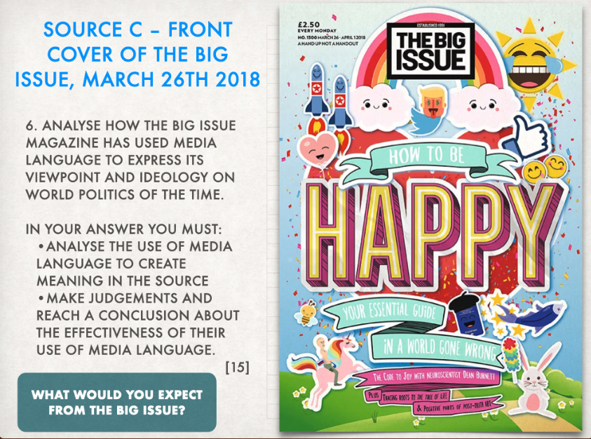
THE BIG ISSUE.
l/O: To research institutions and ideologies behind case study product.
The typography they have used is sans serif with either it being in bold or not. They have decided to use direct address in there magazine we can see this with the quote they have used of "how healthy is your hair" making the magazine more personal and people are more likely to feel like its for them. The register depends on target audience and genre the register is used to relate to the audience. The shot type that they have used is a wide mid shot, the camera has also been placed a little bit to the side to her. They have decided to use a black and white colour palette for the picture and have used pink, white and blue for the writing the only thing that is in pink is the business who made the magazine and that is 'vogue' this is a very popular brand so by making the brand name stand out more people will be compelled to pick it up.
Magazine covers:
- Main image (in the middle of the page)
- cover name
- context of whats inside
- colourful colour palette (bright colours) 2-3 main colours
- well known face or name
- glossy
what is the big issue?
The big issue is a big magazine brand in the Uk they have also expanded there business to help people create a business and have an online shop now, it was made to offer homeless people or individuals at risk of homelessness the opportunity to earn a legitimate income. The people will go in buy the big issue for half the price of what it was made for they will then sell the magazines to earn there own money. The big issue cover things such as; strong social and political themes, entertainment coverage a mix of 'heavy' and 'light' topics. The target audience for the magazine can vary but they mainly try get people who are socially aware of the issue and they also try to sell who are near middle to higher class. Vendors buy the copy of the big issue for £1.50 and sell them to the public for £3. Now they buy it for £2 and sell it for £4.
The big issue was launched in 1991 with the aim of transforming the lives of Londons homeless through its mantra. Since then, the non-profit organisation has spread to cover all of the UK and also has branches in other countries. In 2016, the big issue sold its 200 millionth copy, celebrated its 25th anniversary and launched the big issue shop, a fully customised online platform committed to selling products on social media.
The big issue reader is likely to be university educated, be interested in politics, popular culture and high culture, have a limited disposable income, be socially conscious. The big issue audience is young at heart, educated and loyal. slightly more women then men read the big issue, while 60% of the readers are aged between 18 and 49.
Thursday 14th March 2024.
The big issue:
The big issue shows values and ideologies that suggest it is very left wing this is because the big issue mainly focus on the political side of things. The big issue is mainly aimed at people over 18 years of age this is because the stuff they talk about. They have spoke about adoption for either animals or children they also have paper slips of pay so you can send money for a homeless person. They have pages where they will talk about celebraties. The big issue will talk about issues that have been going on around the world, inside the magazine they have a balance between light-hearted stuff and heavy-hearted stuff. There is the value of helping people who are worse off then yourself, it is massively inclusive and is very diverse. They value a publication that will give them alternative viewpoints from the main stream.
Friday 15th March 2024.
Cover analysis.
L/O: To analyse big issue covers effectively.
The big issue usually go for a more bold magazine cover with a big photo on the front most the time they will use celebrates in there photo they always make sure that the text anchors the text. The mask head on front is split around what the big issue is, in this case it is about the visibility of wheelchair users. They have a main title, they let you know what will be seen inside of the magazine. It has a tone of address which will help with the audience while there buying the magazine to know what the tone of voice is going to be. they use direct address with the lady who is looking right down at the camera making people feel like she is looking directly at them. They have the price of the magazine on the front cover.
layout- The masthead that is used in this has been split this is to make the main image stand out more, the image on the front also goes over the top of the masthead making it pop more, they have decided to add the price on the front of the magazine instead of it being on the back. They have added a few cover lines but the ones that are up all relate to the celebrity on the front image.
Context- The woman in the image in Sophie L Morgan she is a british TV presenter she is talking about how it feels to be "unseen" when your in a wheelchair and is talking about the struggle it was growing up, the words she had used was 'i've been invisible since i was 18' this also gives the audience context of how long she has been in a wheelchair. She had gotten into a car accident when she was 18 and had caused problem with her spine.
Tone- The look of this image makes it seem like the magazine is going to be serious, this is because the woman in the photo is going to be talking about what it was like to be in a wheelchair since the age of 18 and what it was like to be in a car accident.
Representations- The image on the front of the magazine cover represents people with disability.
Ideology-
Intertextuality-
social, cultural and political context-
Thursday 21st March 2024.
Constructing meaning.
The main message for this edition of the big issue is about veterans and how they are living on the street talking about how even though the war is over when they had gone back home it was a completely a new one. The theme for this is about the mental health war i can tell this because if the big blocky writing saying "still at war" and the man in the background is wearing a army hat and the coloured of dark green, green and black, it also says "the battle for peace of mind at home".
When this version of the big issue was released in 2016 Donald trump had been elected president, in the cover we can see that Donald trump is depicted as the slimer alongside popular women as ghostbusters themselfs. The first all female film of ghostbusters was released in 2016 and it didn't do as well as the other ghostbuster films with all male group. In the background we can see the big ben and the white house these are from England and america, it is suggesting that Donald trump is destroying the political and cultural things in america and it is having a impact on England. Theresa may has been put at the front of the ghostbusters showing that she is more powerful then the rest. In 2016 there was Brexit and also there was an outbreak of the zika virus. This suggests that in 2016 it wasn't a good year for either america or England and because Donald trump had just been elected it showing that people know it isn't going to end very well.
Friday 22nd March 2024.
Representation.
connotation of the colour pink?
The colour pink connotates charm, politness and feminity.
what can you say about the photo chosen?
Makes them look like there going head to head, while also showing that its the end of one beginning and the start of another.
what is important about the background of this cover?
The background is black with is associated with misery and death, which shows how the queen had died. the colour pink on the border also contrasts with the black. the colour black also doesn't take the main focus away from the picture.
significance of the cover line?
Charles has always pushed climate change and is very eco friendly and it is a reference to his support with all of it.
connotations of the black masthead?
The colour black is often associated with death this goes alongside with what they are talking about in the magazine, it is talking about the queens death so they have decided to use this colour on the masthead.
why have they chosen to focus on the subject in the wake of the queens death?
This is because the queen is loved by many and she had been the queen of England for many years so a lot of people were upset with this fact. the queens death was published in many places so it also keeps up with the bigger magazines. The pronoun "our" makes people feel more included and about how it was all of our queen not just one persons. it also will be the vendors stories about the queen, how they met her, how they knew her and what there opinions where about her, it also keeps the story about homelessness in the magazine and how it is still a important topic.
What could you say about there expressions?
The expressions on both the queens face and the new kings face looks happy and they both look like they are smiling making it look like the queen is proud of her son. showing they also both have the capability to be king and queen. They have chosen an image with charles in a lot more light while the queen isn't standing out as much, charles also more forward then the queen is.

The colour blue has been put on top to show that conservatives are winning and that red that has been put on the bottom represent labour that are currently losing the debate and they are more in power, by the big issue laying it out like this it makes it more obvious for people who dont really understand. keir starmer represents the labor parties side and rishi sunak represents the conservatives party, the guy standing in the middle of them both is will payne he is a vendor and he doesn't have an opinion on either party and thinks that they both have good arguments. He is also wearing the same colours as the background. The font has been put in white and bold because it contrasts on top of the red and blue but also doesn't take the attention away from the picture and the actual issue. They have decided to edit the picture of rishi and keir so it looks more comical and it could also be saying that they both are big headed and dont think much before they speak. The photos they have chosen rishi has more of a happy expression on his face and he doesn't look like he seems to care or taking it as seriously as keir has more of a serious look on his face like hes actually trying to get his point through to everyone.
Adding the tiny bodies to the big head satirises the funny side of it and can be related to bobble heads.
The colour white that they have chosen to put on top of the red and the white is the same colours of the british flag.
1. Rishi Sunak himself will stand out to the target audience of the big issue, this is because its criticising the conservative party, meaning that they aren't the biggest fan of the conservative party.
2. "truth, reality and what comes next" By saying this its making the audience what to read it and find out what rishi has been lying about and it reassures the reader that they will find out as to why that picture is on the front
3. The HS2 train that is shown in the background is a failed project and it cost a lot of money to try the project, rishi had also used a lot of oil. while tring to se if the project would work. it isnt eco friendly what he had done.
Thursday 28th March 2024.
Essay format.
L/O: To apply previous learning to answer exam style questions.
In this magazine cover by the big issue we can tell that the big issue usually use satire when conveying political topics. By them doing this they can draw more audience in and more people will want to read it. We can see this because in this certain magazine cover we can see 3 big leaders portrayed as something funny, they are also making fun of the leaders making people think that the big issue believe that its a joke. we can tell this by them using stickers and bright colours.
The big issue often uses satire when they are conveying political topics, by doing this they are frequently making fun of certain political or social figures. We can also see how the big issue are making fun of the leaders and making them seem like a joke they have done this by putting stickers on the front cover and the way they have made them look. Iam able to tell that this is an effective front cover because it will make people more drawn into the magazine as they will want to know what they are talking about inside the magazine.
On the front cover we can see that they have made Donald trump the twitter logo with dollar signs in his eyes, this is because in 2018 he had a thing of posting a lot of stuff on twitter and announcements, by putting dollar signs in his eyes they were trying to show how he is money hungry. They have also put Vlad on a unicorn this is a reference to the picture of him on a horse shirtless on national women's day and it had became a meme they decided to change the horse to a unicorn to show how he is childish.
The missiles are are reference to the missiles in china that were going to be fired at America. The emojis that they have used are very child like and show what the big issue thought about the stuff going in 2018. They have decided to place Donald trump in the top middle making him seem more powerful then Vlad but the missiles are at the same height as him also referencing to the disagreement between Donald and Jim.
The message of this front cover was quite clear as we can see who it is going to be about and what they are going to be talking about. (bit confused what to write on the conclusion)
Thursday 18th April 2024.
Media language and exam representation exam questions.
The big issue attempts to position its audience as sympathetic to homeless people. They try to change the stereotype of homeless people who are usually known for being worthless or a victim. This is anchored by its tagline 'hand up not a handout' which promotes the big issues want to help people get a home and off the streets and about the shared social responsibility.
LEARN THIS!!!!!!!
Friday 18th April 2024.
Media language and representation exam questions.
1. How effective is the distribution model of the big issue?
The way the big issue distribute there magazines is very effective and efficient, this is because they have 3 different ways you can buy there magazines the first way is how they sell there magazines face to face through there vendors, the vendors will buy the magazine for £2 and sell them for around £4, the reason this works really well is because it starts a relationship between the vendor and the buyer because you can see who your money is going to and the sellers then tend to be loyal to there vendor and only buy from there vendor, the second way of buying there magazine is online on there website, on this website you can find your vendor and buy off of them still keeping the bond between vendor and the seller, the last way you can buy the magazines is in the shop this method might not work as well because the people cant see who the money is going too.
2. How does the shelter campaign compare to traditional, stereotypical representations of homelessness?
The shelter campaign tend to show more depressing and upsetting photos of homeless people on the street, they make it out as homeless people are scruffy animals when they are not and this is a big stereotype that The big issue are trying to get rid of. In the big issue we can see people more happy and they look groomed and clean in the shelter campaigns these photos are completely diffrent. The shelter campaign tend to show more depressing and upsetting photos of homeless people, they also make the homeless people look dirty and this is a stereotype that is used by the media quite a lot, the big issue is one of the many charity that dont like this stereotype and is trying to get rid of it as in there photos they show people more happy and well groomed.
3. Why might artists such as radiohead choose not to appear in there music video?
A lot of artists such as radiohead tend not to appear in there music video, they do this so it doesn't take away the focus on the meaning in the song and not on them and because they might not be that popular of a band and dont want to take the focus away from the music video itself.
Postmodern- The diversity of human experience and multiplicity of perspectives. (Lego movie)
Intertextuality- The relationship between texts, especially literal ones.
Ideology- A set of opinions or beliefs of a group or an individual.
Ethnocentrism- The attitude that ones own group, ethnicity or nationality is superior to others.
Value transference- A product or service set of messages, values and ideologies must be communicated.
Xenophobia- Dislike of or prejudice against people from other countries.
Stereotype- A widely held but fixed and oversimplified image or particular type of person or thing.
Connections-
In the music video burn the witch, they reference texts such as the 1973 film the wikerman and trump-ton a bbc stop motion film from 1967. They do this as a short-cut to the meaning they are tying to say.
River island have decided for the text to say "smooth moves only" in there advert, they have also made sure the text was bold and a brighter colour to then background making it stand out more. River island started the #laybels are for clothes, the company had decided to start this hashtag to show there audience and others that just because person has a disability doesn't mean they cant wear the same clothes as others. This River island advert is effective this is because there model Jordan Luce is spreading body positivity to those with a disability making them feel more confident and comfortable in the clothes they are wearing leading to more people liking the brand and wanting to be a loyal customer to the business.
Monday 27th January 2025.
Media language and representation exam questions.
Paper 1 section B= 35%
2 questions
Q5: 10 mark - 17 mins
Q6: 15 mark - 25 mins


MV INTRO & INITIAL NOTES:
ReplyDeleteGreat notes.
MV CASE STUDY 1 NOTES:
Some great notes and insights. Well done. Make sure you use specific and accurate terminology where possible.
MV CS1 REP Q:
WWW: excellent use of social context, supported by media language.
EBI: try including theory where relevant - e.g binary oppositions
MV CASE STUDY 2 NOTES:
Good - great ideas on intertextuality - you have linked to the CONTEXT.
MV EXAM Q:
WWW: excellent analysis with in clear examples and links to context!
EBI: make sure you use specific media language in your examples - camera shot types, MES etc.
ADVERTISING INTRO ANALYSIS:
A good start but you need to make sure you are linking the techniques used to the messages in the adverts.